Get started with PriceLabs now!
Want to learn what PriceLabs can do for you? See for yourself with a free trial. Get started now!
PriceLabs Market Dashboards turn daily-updated Airbnb and Vrbo data into charts that show how a vacation rental market is performing. Owners and property managers use them to compare their listings with competitors, set prices and minimum stays, and size up markets before they invest.
Every chart points to a decision about price, minimum stay, or investment, which makes a Market Dashboard a practical price optimization dashboard. It sits within the wider field of short-term rental analytics, and the sections below show how owners use it.
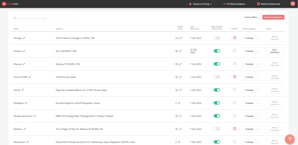
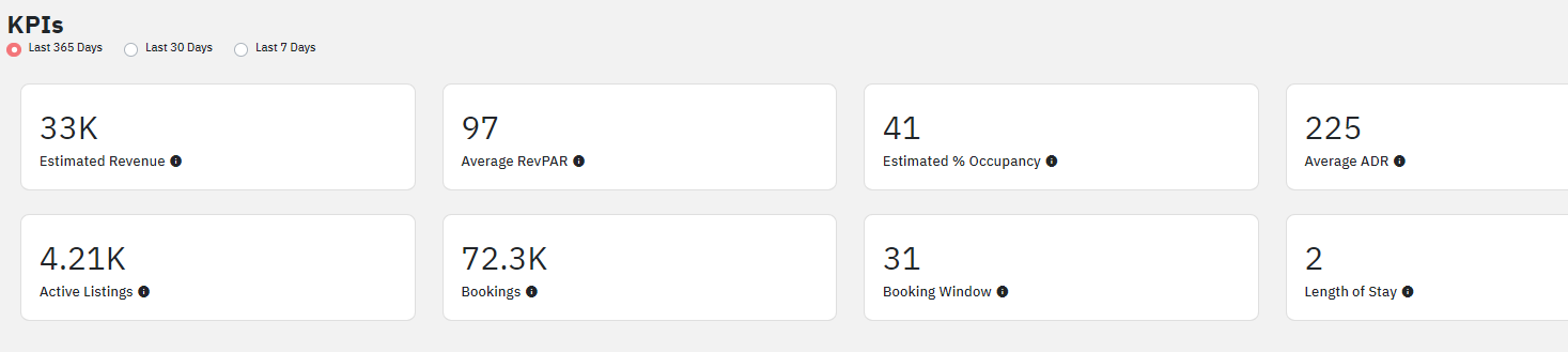
PriceLabs Market Dashboards are fully automated, personalized dashboards that track short-term and mid-term vacation rental data worldwide and display it as charts and insights. There are two ways to start. Ready-to-View dashboards cover more than 200 popular markets and load instantly. A Custom Market Dashboard lets you enter an address and choose how many listings to include (1,000, 5,000, or 10,000), or draw your own area on the map. Dashboards report metrics such as annual revenue, RevPAR, ADR, and occupancy.
The scraped data comes from Airbnb and Vrbo. It is updated daily and processed by our data science team to remove outliers and bad data sets and then converted into actionable insights. This data is NOT direct booking data. However, we capture direct bookings by tracking OTA availability. The dashboards include the past two years of history plus projections up to a year ahead.
Vacation rental owners and property managers use PriceLabs Market Dashboard for various reasons. Some of them are listed below:
Market Dashboards help you determine what customizations and pricing strategies would best suit your market. For example, you can decide what minimum stay strategy to use. You can also see which dates are receiving more bookings and set your prices and minimum stay accordingly.
It will help you to understand how to price your Airbnb listing.
Since you don’t need to have listings to access Market Dashboards, you can use it to analyze the booking trends and performances of vacation rentals in a particular area. You can analyze the market based on various crucial KPIs like LOS trends, average occupancy, average revenue, seasonality, market demand, and much more.
An understanding of how vacation rental markets are performing based on these metrics will help you make more informed investment decisions.
Many owners use Market Dashboard to compare their listings’ performances with other listings to identify their strengths and weaknesses and strategies that they can work on. This is a great tool to identify your booking trends with others and determine if you want to switch to a different property manager who is better at managing listings in your area.
You can also create a comp-set in Market Dashboards that doesn’t include your own host ID. You can exclude your listing when making comparisons to get a better understanding of the overall market trends and performance. Also, you can compare the performance of a specific property manager in addition to excluding your own listings.
Make sure that you are focusing on specific listings’ markets if you want Market Dashboard to work for you successfully for any of the above-mentioned use cases.
You get one Market Dashboard free, with no credit card required, when you add a listing to PriceLabs Dynamic Pricing. Paid plans start at $9.99 per month, and you can add more dashboards or larger markets whenever you need them.
Then build your dashboard in four steps:
You can also use PriceLabs Portfolio analytics to understand your listing performance and improve your pricing strategy for free.
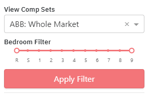
Once you have created a dashboard, you’ll see all the listings in that area. You can choose to look at specific listings based on the number of bedrooms by selecting those in filters at the top left corner.
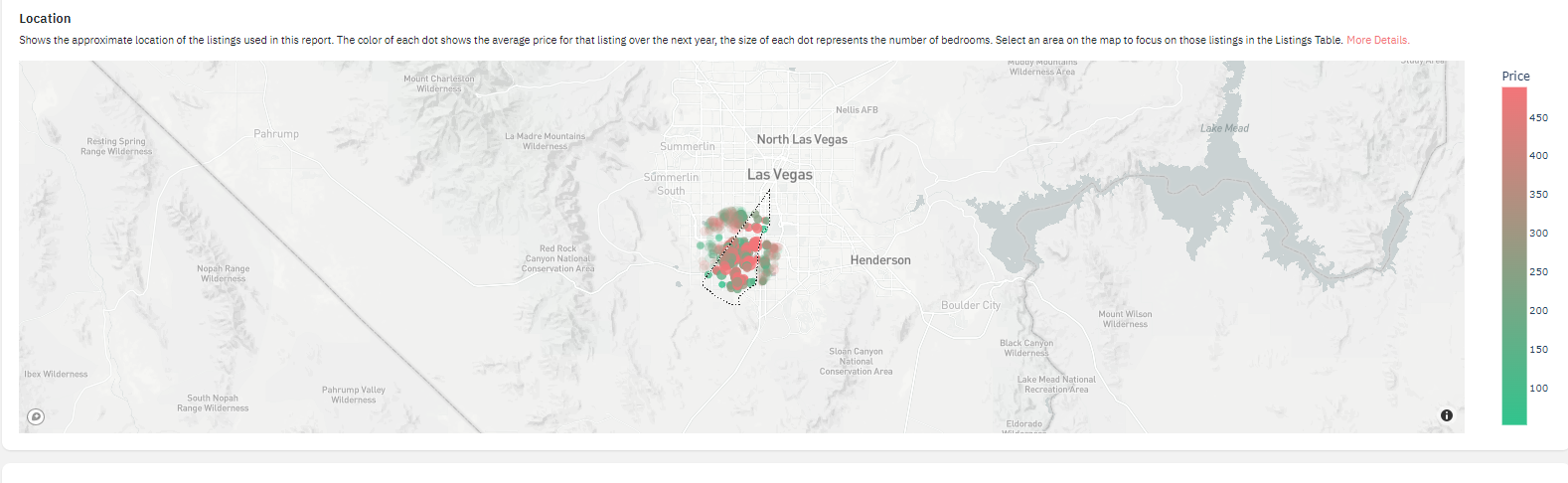
The map will show the approximate location of the current active listings in the report area. You can hover over each dot on the map view to see how many bedrooms that listing has, along with the average rate over the next year. The color of each dot is determined by the listing’s average rate, while the size of the dot corresponds to the listing’s size. The tool in the top right of the map will let you pan, zoom, and select areas on the map. Double click on the map to unselect any selections you’ve made.
You can also customize groups to manage multiple listings together.
A comp set is a group of properties similar to yours in location, size, and amenities. A dashboard holds up to 30 comp sets with more than 40 filters, so you can build one for each neighborhood or listing type. Match yours closely, because a fair comparison is what lets you benchmark your performance honestly. Comp sets you save here also appear in Dynamic Pricing under Neighborhood Data and in Portfolio Analytics, so you only build them once.
To look at data from specific kinds of listings, you can create a comp set. To do this, you can draw a lasso on the map to select the particular area from which you want to retrieve the data. When you click on create comp set box, you will only see vacation rentals from that specific area.
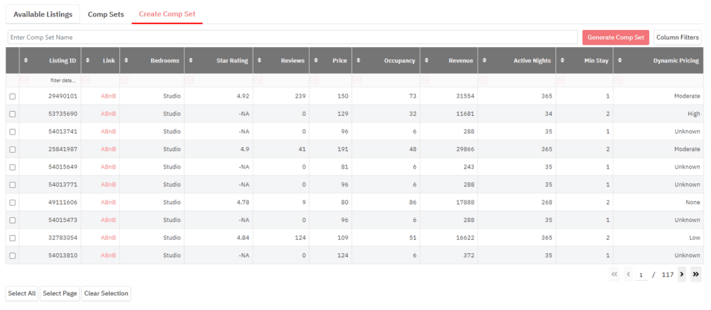
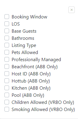
You can use the bedroom filter on the left to select a specific number of bedrooms per unit and see properties with that bedroom count. Then use the check box to add the bathroom filter to the listing grid. Filter by bathroom count and select the listings you want to include in your comp-set. You can also choose properties based on their reviews, their management style (individual property or managed by property managers), amenities, etc. Just click on column filters to select your preferences.
Now, you can select all the properties that appear after applying the filters by clicking on ‘Select All’ or manually selecting the properties you want to analyze. You can also sort these properties by clicking on any of the given criteria.
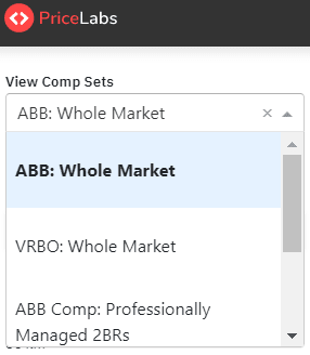
Once you’ve selected your vacation rental listings, give the comp-set a name and click ‘Generate Comp Set’. You’ll be prompted to verify the name and number of listings included. Click to confirm your selection, and your comp-set will appear on the list of available comp-sets in the drop-down on the top left of the Dashboard. You can use your comp-sets or any of our pre-loaded comp sets to filter the data shown in the rest of the Dashboard.
You can view each listing on Airbnb using the link provided against each listing.

You can use the Market Dashboard to make informed decisions about your revenue management strategy. We can help you in the following ways:
To view the prices set by other listings you have selected in your comp-set, you can set a filter for ‘Median booked Prices’ under the Future Price section. The colors will show you what prices people are booking at. The median listed price is the one where the black line touches the pink line.
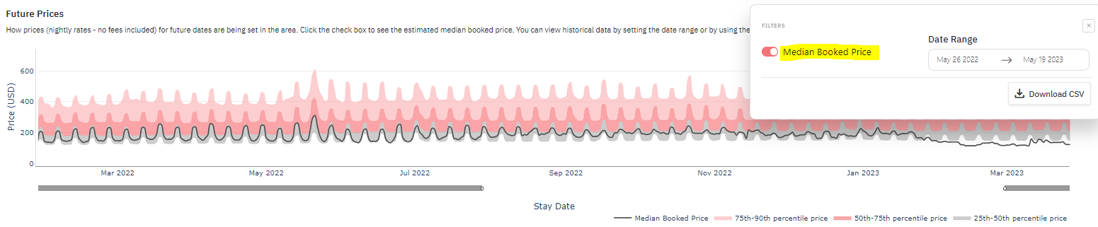
In the example chart, the median booked price sits below the median listed price in the low season and above it in the high season.
For example, if comparable three-bedroom listings are booking at a median of $200 for the summer and your rates average $170, you may be leaving revenue on the table. Before you raise rates, check how your reviews and amenities compare, since both help you stay competitive.
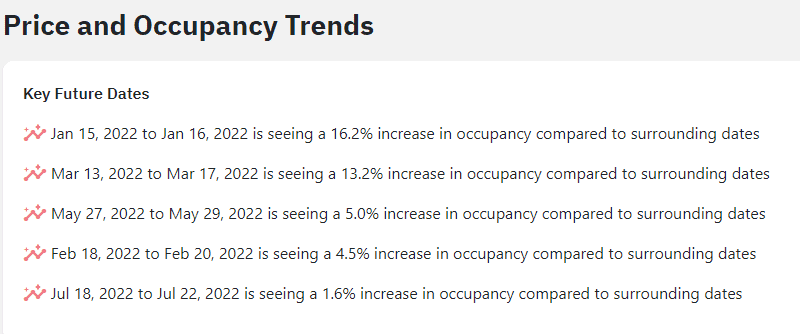
Key Future Dates appear under the Price and Occupancy Trends section. This chart spotlights a few dates with a higher occupancy percentage than those surrounding them. You can use the listed dates to spot emerging high-demand periods and adjust pricing and stay requirements accordingly. You can check out how each of these dates appears on the Future Occupancy Chart below to compare how bookings are being made on surrounding dates.
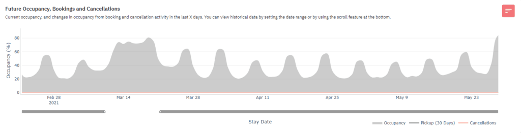
The occupancy graph can give you an idea of which dates are still busy and which are low-demand dates. The data helps you to understand how you should price your property according to market demand on different dates. By default, the chart will show the following year’s data, but you can use the sliders below the chart or the date range selectors to narrow in on a shorter date range or select the number of past days for which you’d like to see booking activity.
By selecting the date range or scrolling the bar at the bottom, you can have a historic view of the data. You can see which dates witnessed a higher booking trend in the previous year and make booking forecasts accordingly.
The Future Prices graph details how property managers are pricing their properties for future dates. Between this and the graph above, you can start thinking about your properties’ revenue management strategy.
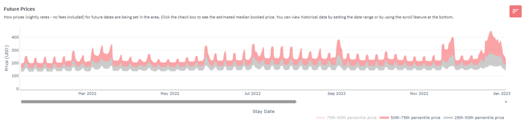
The Median Booked Price line estimates the prices at which listings are getting booked. This line is not shown by default since it’s an estimate, but you can add the line to view the forecasts along with the percentile graphs by ticking the Median Booked Price box above the chart.
The Length of Stay by Stay Date graph shows the typical duration of bookings made for any given date in the past number of days selected. You can hover your mouse over the graph to see details on stay length and average nightly rate for a specific date. This helps you identify how long guests typically book for during significant events, holidays, etc., allowing you to set minimum stay restrictions and booking overrides accordingly.
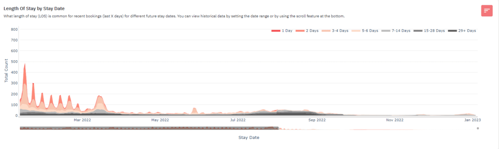
You can also check out the past LOS trends by using the black line below the graph to scroll back in the LOS by stay date graph.
You can set your minimum stay strategy by looking at your selected dates’ length of stay by the stay date graph. For the dates that are receiving more days, your property will more likely be booked for a higher number of nights if you increase your minimum stay for those dates.
LOS vs. Booking Window charts compares the booking window to the length of stay for booked nights. The number of busy nights for each lead time range is presented in the left chart and the number of occupied nights booked in each stay length category is presented in the right chart.
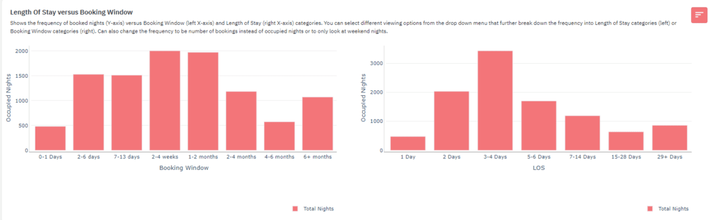
If you click the drop-down, you can see different options to view occupied nights and bookings data. The options there are:

If you switch your view to break down the occupied nights by LOS and booking window, you can see on the left that last-minute stays booked in the past 30 days range in length from 2 to 14 days. On the right side, you can see that lead times for the popular 3-4 day stays in this area are usually 2 days or more.
This section has two charts detailing desired features in a listing. The chart shows the percentage of vacation rentals with an amenity and the percentage of bookings received by the listing with that amenity. The ‘Common Amenities’ chart presents the amenities by the percentage of listings that have them. In contrast, the Desired Amenities chart arranges the amenities by those with the most significant difference between the percentage of listings with that amenity and demand for those listings.
This can help you determine if providing an extra service would be worth the investment or not. If a certain amenity is in demand in your market, then you can include that in your listing and competitively price your vacation rental.
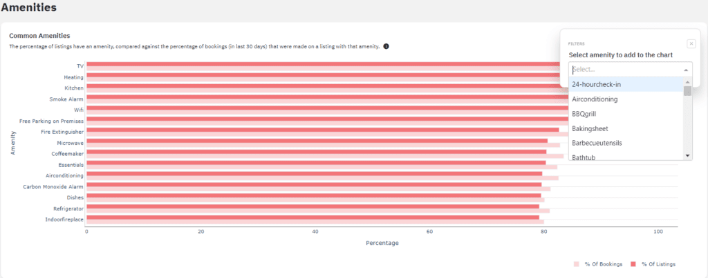
If there is a specific amenity you are trying to find details on, you can use the search bar to see how many listings in your area have that amenity. Note that this searches only for the 50 most common amenities in your market. If an amenity, like shampoo, is in high demand right now, make sure to add that to your vacation rental and its listing page.
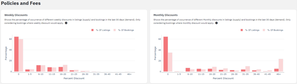
Similar to the amenities charts, the Weekly Discounts and Monthly Discounts charts show the percent of bookings made in the past 30 days compared to the percent of listings that have a fee in that range.
It shows which weekly or monthly discounts are more popular. The red-colored bar on the chart shows the percentage of listings that offer discounts. The pink-colored bar exhibits the percentage of bookings received for a specific discount range.
The given chart shows the percentage of listings and bookings made for different Cleaning Fees and Cancellation Policies.
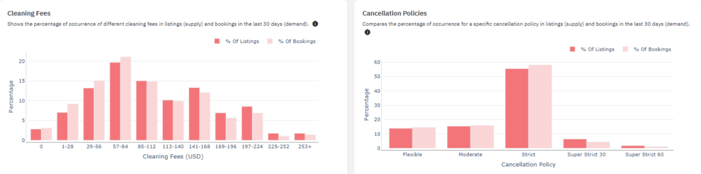
Pre-filtering the comp sets makes sure that your cleaning fee is not compared to a listing with a larger or smaller bedroom count. To determine your cleaning fees, you should go over the cleaning fee graph that has the percentage of listings with a specific fee vs. the percentage of bookings. This helps you avoid setting a very high or low cleaning fee. Otherwise, it would either discourage bookings or result in a lack of profits for the owner.
Market Dashboards give you the broader market view for strategy, while Dynamic Pricing adjusts your nightly rates every day based on demand, seasonality, and local events. Many owners use the dashboard to decide what to do and the pricing tool to apply it.
Dashboards also help you share what you find. You can create branded PDF reports with your logo and colors, and weekly summary emails keep owners and teammates up to date on what changed. AI insights can turn charts into plain-language explanations for people who do not read charts all day.
If you are looking to invest in a vacation rental property, then the market dashboard can help you determine if the market is worth investing in. You will have to first create a comp set with all the amenities and bedroom count you intend to invest in.
For a revenue estimate on one specific property, Revenue Estimator Pro is the better fit, while a Market Dashboard shows the market around it.
PriceLabs Market Dashboards are a popular tool among vacation rental owners and property managers. Add a listing to Dynamic Pricing to get your first dashboard free, with no credit card required, and paid plans start at $9.99 per month.
No. You can analyze any market that has Airbnb or Vrbo listings, which makes dashboards useful for investors and future hosts. Your first dashboard is free when you add a listing to PriceLabs Dynamic Pricing, and paid plans start at $9.99 per month.
The data comes from Airbnb and Vrbo and is updated daily. PriceLabs processes it to remove outliers and bad data before turning it into charts.
Not directly. A booking made on any channel blocks the dates on the Airbnb calendar, so the dashboard captures direct bookings by tracking OTA availability.
You can create up to 30 comp sets in one dashboard, using more than 40 filters such as location, bedrooms, amenities, and ratings.
Yes. Charts can be exported as a PDF, and data from individual sections can be exported as a CSV. The underlying booking data cannot be exported.
A Market Dashboard gives you the broader market view for strategy. Dynamic Pricing adjusts your nightly rates every day based on demand, seasonality, and local events. Together they cover the decision and the daily execution.
Market Dashboards provide listing-level reports for 1,000, 5,000, or 10,000 listings, with comp sets and two years of history. Revenue Estimator Pro gives an instant revenue estimate for a specific property, based on up to 350 similar listings within 15 km.
Want to learn what PriceLabs can do for you? See for yourself with a free trial. Get started now!